How to Make Academic Slides
Creating academic presentations is a peculiar art form, distinct from other types of public speaking. In this post, I share principles for crafting academic presentations that I’ve gathered from my short experience of giving seminars and — perhaps more importantly — sitting through countless others.
The Philosophy Behind Academic Slides
It’s first useful to think about some features of an academic presentation setup, which differ markedly from corporate presentations.
- Complex content: Academic presentations often tackle material that resists simplification. A corporate presenter can conclude “this intervention increased sales by 10%” and move on. You, however, need to explain your identification strategy, show robustness checks, and address potential confounders. This fundamental difference in content complexity shapes everything about how we approach slide design.
- Competition for attention: In my experience, academic audiences tend to have shorter attention spans than their corporate counterparts. Perhaps it’s because there’s usually no immediate stake in the findings — unlike a quarterly strategy meeting where jobs and budgets hang in the balance.
- Interruptions are common: Academic talks operate on an entirely different rhythm than corporate presentations. Questions and interruptions aren’t just common - they’re central to the format. Your presentation needs to accommodate spontaneous deep dives into methodology or extended discussions about alternative interpretations.
- Limited room for embellishment: Academic presentations generally maintain a more serious tone than their corporate counterparts. For academic presentations, it is very uncommon (and counterproductive) to open with an inspirational quote or industry meme. This doesn’t mean academic slides must be bland, but they just need to prioritize clarity and substance over style.
General Structure
Most academic presentations follow a basic format:
Opening (2-3 slides)
Main Results (bulk of presentation)
Conclusion (1 slide)
Backup Slides
Opening
Your opening slides need to accomplish three things: (i) establish why the audience should care, (ii) preview your key findings, and (iii) explain why these findings matter. Think of it as an elevator pitch with just enough detail to orient your audience.
A common pitfall here is the “kitchen sink” opening. Presenters, eager to demonstrate the depth of their work, often reveal too much details.
- As an example, suppose you’re presenting research that estimates the elasticity of labor supply with respect to wages, and you’ve discovered that this elasticity varies meaningfully with bitcoin prices. In your opening, you might be tempted to show your headline figure—a beautiful time series plot showing how the elasticity co-moves with bitcoin prices over years.
- But instead, you can simply state this in a bullet: “labor supply elasticity co-moves strongly with bitcoin prices.”
There are two main reasons why showing just a bullet is more effective:
- First, showing the full figure early invites a host of technical questions—about your identification strategy, your treatment of business cycles, your handling of confounders—before you’ve had the chance to explain your methodology. Audience members might fixate on a particular spike in your graph or question your choice of time period, derailing your narrative before it begins.
- Second, it maintains suspense and audience engagement. When you present a striking finding as a simple statement, you create anticipation for the detailed evidence to come. Your audience will be more attentive during your methodology section because they’re waiting to see how you arrived at this intriguing result.
By presenting the intuition first and saving the technical details for later, you keep your audience focused on the big picture and maintain control of your presentation’s flow.
Main Results
The main body of your presentation generally follows the paper’s structure. It’s important to make sure that each section builds naturally from the previous one, helping the audience follow your research journey. Unlike your paper, where readers can flip back and forth between sections, your presentation needs to maintain a clear forward momentum.
Some key principles:
- Always remind the audience where you are in the broader narrative. A simple roadmap slide that you return to between sections can help, especially for longer seminars.
- When presenting empirical results, lead with the specification before showing results. A common mistake is jumping straight to coefficient plots without explaining what you estimated.
- Consider the “one major point per slide” rule. While not absolute, it’s usually better to split complex tables or multiple findings across slides rather than cramming everything onto one.
- Tables should be reformatted for presentation. Consider splitting large tables across multiple slides, especially if discussing different columns. Add visual elements - arrows or boxes can guide attention to key comparisons.
- Figures should be reformatted for presentation. A common mistake is that legends are often unreadable in presentations. For complex figures with multiple elements, consider using overlays where you add elements progressively after starting from a simple version.
Conclusion
Your conclusion slide serves one primary purpose: giving your audience something concrete to remember. Keep it focused with no more than three key findings. A good test is whether someone could summarize your talk in a 20-second conversation at the water cooler.
- The conclusion should mirror your opening to create a sense of narrative completion
- Focus on the broader implications rather than specific estimates
Backup Slides
Think of backup slides as your insurance policy for Q&A. They should include: additional specifications and robustness checks, additional details on methodology, supplementary figures and tables, and responses to common questions. Having a good set of backup slides communicates preparation, which can be especially valuable at high-stakes presentation.
Good backup slides often save more than just the Q&A - they give you confidence during the main presentation because you know you’re prepared for likely questions.
Designing Opening Slides
I want to spend some time discussing the design of opening slides in detail. What follows is a template that many successful presentations use, and I’ve found it to be effective. This isn’t necessarily the only or best way to open a presentation, but if you’re looking for a mental model to structure your opening, this approach has proven reliable.
Slide 1: Introduction
Think of your first slide as having three vertical blocks that flow naturally into each other. The first two blocks create the “space” for your research question, while the third block describes your paper’s contribution. Here’s an example below:
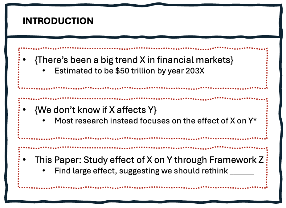
- The first block sets up the foundation by stating a fact that everyone can agree with. Ideally, you want something concrete - a clear trend, a widely-acknowledged phenomenon, or a measurable change in markets or policy. This block should feel almost obvious to your audience - they should be nodding along.
- The second block creates the tension by identifying what we don’t know about this phenomenon. This is where you point out the gap in our understanding or the limitation in existing research. A common and effective approach is to note how the literature has focused on a related but different question. This block should make your audience lean forward - they should be thinking “yes, that’s actually a good question.”
- The third block introduces your paper’s contribution in broad strokes. Notice how you’re not diving into methodology or specific numbers yet - you’re just telling them what aspect you’re studying and giving a taste of why the results matter. The goal is to communicate “here’s what we do” without inviting technical questions that would derail your narrative flow. Save the details for later when you’ve properly set up your framework.
Slide 2: Setting the Stage
The second slide can serve multiple roles, all aimed at focusing your audience’s attention before you dive into your methodology. Here are the main approaches:
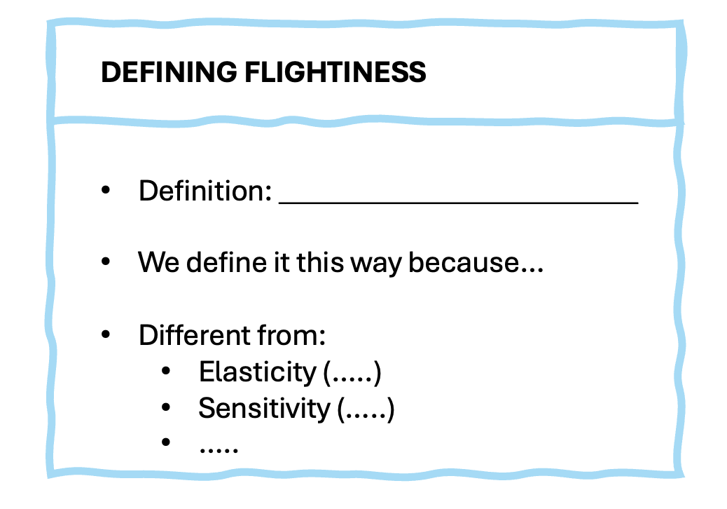
- Your first option is to provide sharp definitions of key concepts in your analysis. For example, if you use the word “flightiness” throughout your paper, it helps to first provide a precise definition that everyone can work with. This prevents confusion later when you present your results, and gives the audience a concrete object to think about. The clearer your definition, the less likely you are to face questions about “but what if you defined it differently?”
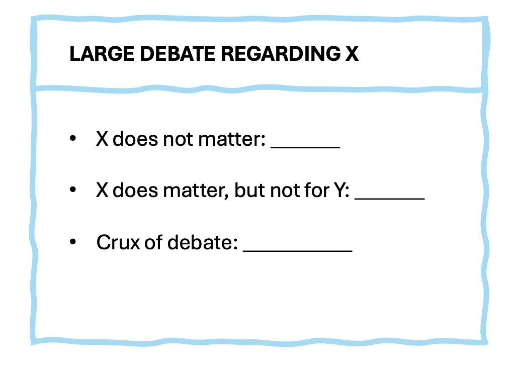
- Another approach is to expand on limitations in the existing literature. This gives your audience a bird’s eye view of how economists have tackled similar questions in the past. It’s important to be diplomatic here - you’re not criticizing prior work, but rather explaining why certain questions remain unanswered. For instance, you might note that “while prior work has focused on X, institutional constraints have made it difficult to study Y.”
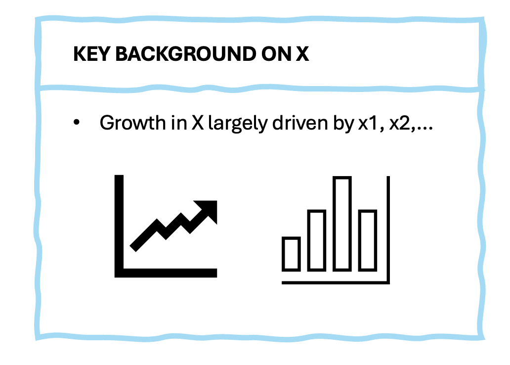
- A third option is to highlight crucial institutional details that the audience needs to know to understand your work. This is particularly useful for papers studying policy changes or market structure. For example, if your identification comes from a regulatory change, this is your chance to explain the institutional environment before and after the change.
- Finally, you might choose to present a real-world example that illustrates your research question. This can be especially effective if you’re studying something abstract or technical. A concrete example helps the audience connect your research to phenomena they observe in the world. For instance, if you’re studying how information flows affect market stability, you might walk through a specific market event that illustrates your mechanism.
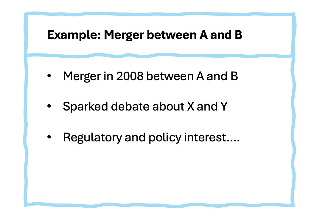
The key role for Slide 2 is to create anticipation for your methodology slide that follows. By the end of this slide, the audience should be thinking “OK, I understand what they’re studying and why it matters - now I want to see how they tackled it.”
Slide 3: This Paper
The third slide is a “summary” of your paper. It needs to provide enough detail to give your presentation credibility, but not so much that you lose your audience. Let me explain how to strike this balance effectively with the example below.
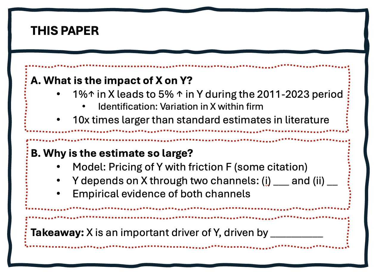
First, structure the slide around clear research questions. Instead of saying “We study X,” pose actual questions: “What is the impact of X on Y?” This approach accomplishes two things: it makes your paper’s structure transparent and it creates natural breaks in your presentation. The example shows how each question (A and B) builds on the previous one, creating a logical flow. For each research question, provide just enough methodological detail to establish credibility. Notice in the example how we include “Identification: Variation in X within firm” - this signals to the audience that you’ve thought carefully about causality, without diving into the regression equations. Similarly, include one memorable number that you want the audience to take away - “1% ↑ in X leads to 5% ↑ in Y.” This gives them something concrete to hold onto.
Similarly for the second research question block, you want to provide just enough details. If your paper has a theoretical component, mention the key friction or feature that drives your results (“Model: Pricing of Y with friction F”). The goal is to signal the economic forces at work without getting bogged down in derivations.
Finally, end with a one-line takeaway that’s bigger than the paper itself. Don’t just summarize your findings - tell the audience why they should rethink their prior beliefs about the field. Notice how the example’s takeaway - “X is an important driver of Y, driven by ___” - speaks to broader questions in the literature, not just the specific estimates.
Some Practical Tips
I end with some practical tips that might seem minor but can significantly impact your presentation’s effectiveness.
- The art of text economy on slides cannot be overstated. Simply copying sentences from your paper into bullet points is a common mistake that leads to cluttered, hard-to-follow presentations. Instead, work to distill your ideas into concise phrases. Use arrows (→) to show causality or progression, and mathematical symbols (↑, ≈, ∝) when appropriate. For instance, rather than writing “increase in X” simply write “X ↑”.
- Slide numbering requires some strategic thinking. Show your current slide number - it helps with Q&A navigation - but consider being clever with the total count.
- One effective approach is to number your main presentation slides separately from backup slides. For example, if you have 40 slides total but 15 are backup, show “Slide 12/25” instead of “12/40”. This prevents that subtle deflation in audience energy when they realize they’re only halfway through a long deck.
- The question of whether to make your title slide a complete sentence (e.g., “Bank Runs Occur Because of Information Asymmetry” versus “Bank Runs and Information Asymmetry”) deserves careful consideration. The benefit of a sentence title is that it immediately communicates your paper’s main finding. However, this approach can backfire by making you seem overconfident or by giving away too much too soon. My preference is to save the declarative statement for your conclusion - let your audience follow your journey to that conclusion.
- While progressive revelation of slide content can be effective for controlling narrative flow, avoid the temptation to use semi-transparent or grayed-out text for future points. It’s distracting - audiences will squint to read ahead instead of focusing on your current point. If you want to reveal content gradually, use clean transitions: either points appear or they don’t.
- Number of Slides. For a talk of an hour and half, prepare around 22-28 slides. If you talk uninterrupted through a presentation for a one-and-a-half-hour seminar, it should take about 45 minutes (Lasse Pedersen) 80 minute presentations should have about 35 slides, and 40 minute presentations should have about 15 slides. (Yale Finance Lunch)
Conclusion
Creating effective academic slides is about finding the right balance - between detail and clarity, between rigor and intuition, between comprehensiveness and focus. The key is to keep your audience’s journey in mind: they should leave your talk understanding not just what you found, but why it matters.
Perhaps the most important thing to remember is that slides are meant to support your narrative, not be the star of the show. The best academic presentations I’ve seen weren’t necessarily the ones with the most polished slides, but rather those where the slides so effectively supported the speaker’s story that they became almost invisible, leaving the audience focused entirely on the ideas being shared.