Figure Ones
It’s not uncommon to hear academics say “Oh, I finally have my Figure 1!” — the killer graph that succinctly summarizes a paper’s key findings and captivates readers with its visual impact. In this post, I explore some of the interesting Figure 1’s in economics, dissecting what makes them so powerful and memorable.
Introduction
In economics, there’s often talk about the elusive “Figure 1” — that one graph or visual that encapsulates the entire essence of a paper. It’s the showstopper, the conversation starter, the visual hook that draws readers in and leaves a lasting impression.
A well-crafted Figure 1 can summarize complex findings, highlight key trends, or showcase cool results in a single, powerful image. There seem to be two types of Figure 1s. First is the type that shows a reduced form relationship, with the paper later providing an explanation for it. I’ll refer to this as “Correlation First, Explanation Later”. The second is the type that summarizes the paper and shows the identification strategy, which I’ll refer to as “Methodology in a Picture”.
“Correlation First, Explanation Later”
Many figures serve as a powerful visual hooks that present a striking empirical relationship upfront, leaving readers curious about the underlying mechanisms. These figures are effective because they immediately engage the audience with an intriguing pattern, prompting them to read further for the explanation. They serve as a visual abstract, summarizing the paper’s key finding in a single, memorable image.
Example 1. Xiao (2020)
“Monetary Transmission through Shadow Banks”
This example is from Kairong Xiao’s job market paper. The figure shows the relationship between Federal Funds rates and deposit growth rates for commercial banks versus shadow banks from 1987 to 2013.
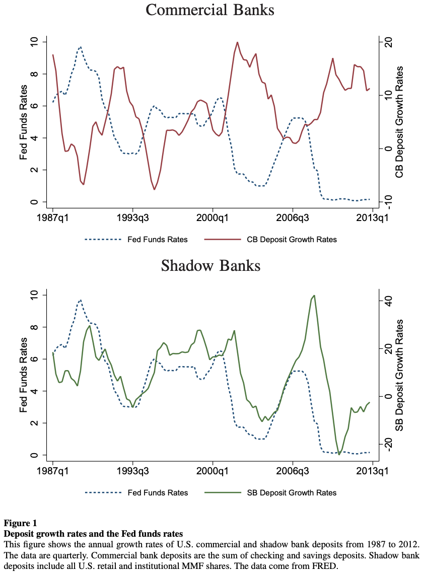
Strikingly, it reveals that shadow bank deposits expand when interest rates rise, contrary to the behavior of commercial bank deposits. This counterintuitive correlation sets up the paper’s exploration of how shadow banks respond differently to monetary policy, challenging conventional wisdom and highlighting the importance of considering the shadow banking sector in monetary transmission mechanisms.
Example 2. Hall (2017)
“High Discounts and High Unemployment”
The next example is from Hall (2017), which argues that when discount rates are high, the value that employers attribute to a new hire also declines and leading to higher unemployment. The author does not hesitate in making this point early in the paper, particularly through the figure that shows the relationship between the unemployment rate and the inverse of the real, detrended value of the S&P stock market index from 1948 to 2015.
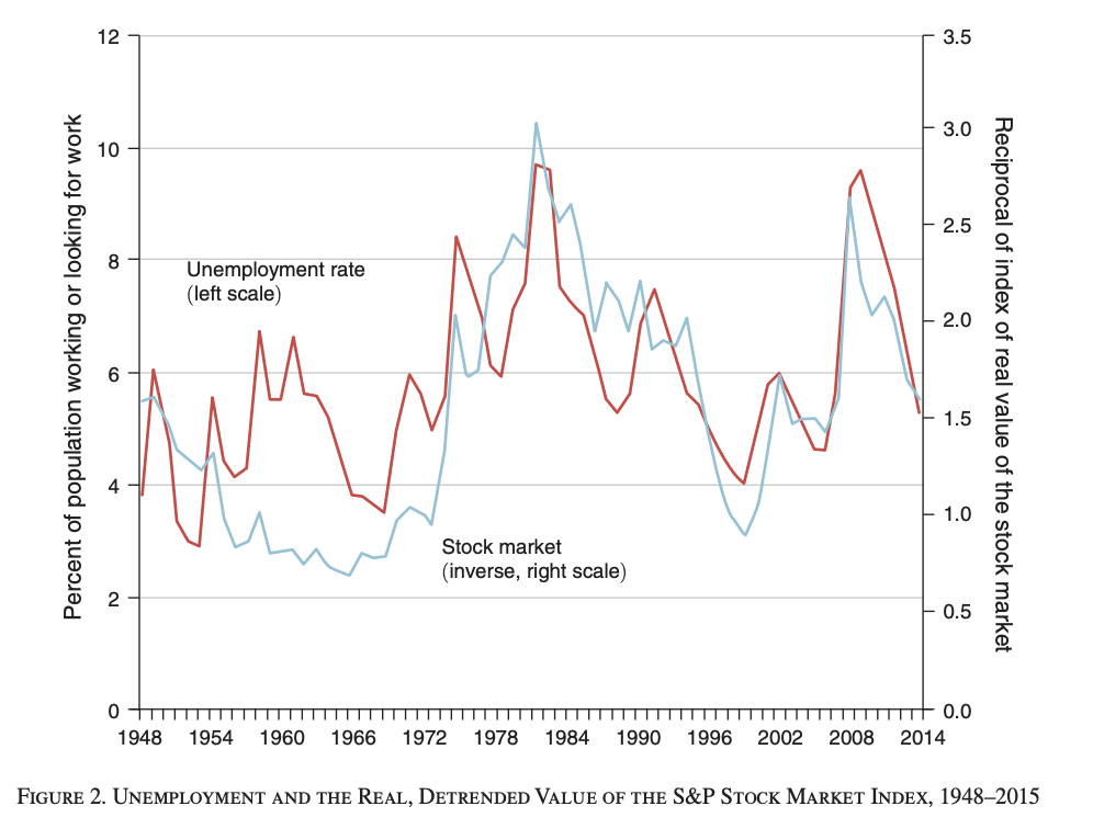
It shows that when the stock market value is low, unemployment tends to be high, and vice versa. This visual sets up the paper’s exploration of how discount rates affect unemployment, challenging the conventional focus on productivity shocks.
Example 3. Krishnamurthy and Vissing-Jorgensen (2012)
“The Aggregate Demand for Treasury Debt”
Krishnamurthy and Vissing-Jorgensen (2012) document and analyze the “convenience yield” of U.S. Treasury securities. The figure below motivates their paper, which shows the relationship between the Aaa-Treasury corporate bond spread (y-axis) and the debt-to-GDP ratio (x-axis) from 1919 to 2008.
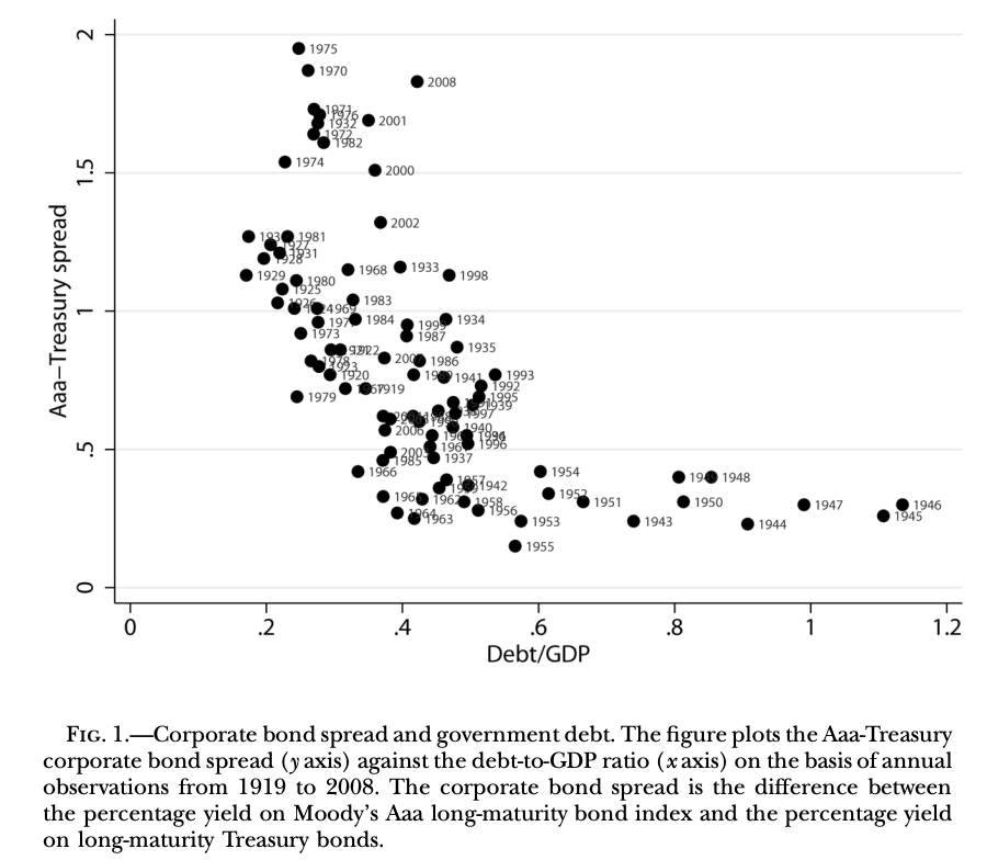
It shows that when the supply of government debt is low, the spread between Aaa-rated corporate bonds and Treasury bonds is high, and vice versa. This serves as a powerful introduction to the paper’s main argument: investors value Treasuries for their liquidity and safety attributes, which causes their yields to be lower than those of other assets, especially when the supply of Treasuries is low relative to GDP.
“Methodology in a Picture”
There is a different kind of Figure 1’s that contain more information — it can visually demonstrate a paper’s empirical approach, helping readers understand the identification strategy at a glance. They are particularly well-suited for empirical designs that can be easily visualized, such as difference-in-differences (DiD), regression discontinuity designs (RDD), or event studies.
Example 1. DeFusco and Paciorek (2017)
”The Interest Rate Elasticity of Mortgage Demand: Evidence from Bunching at the Conforming Loan Limit”
DeFusco and Paciorek (2017) estimates the interest rate elasticity of mortgage demand. To do so, they exploit the conforming loan limit — the maximum size for loans that can be purchased by Fannie Mae and Freddie Mac — which creates a discontinuity in interest rates.
Their figure 1 is crucial in demonstrating the paper’s empirical approach:
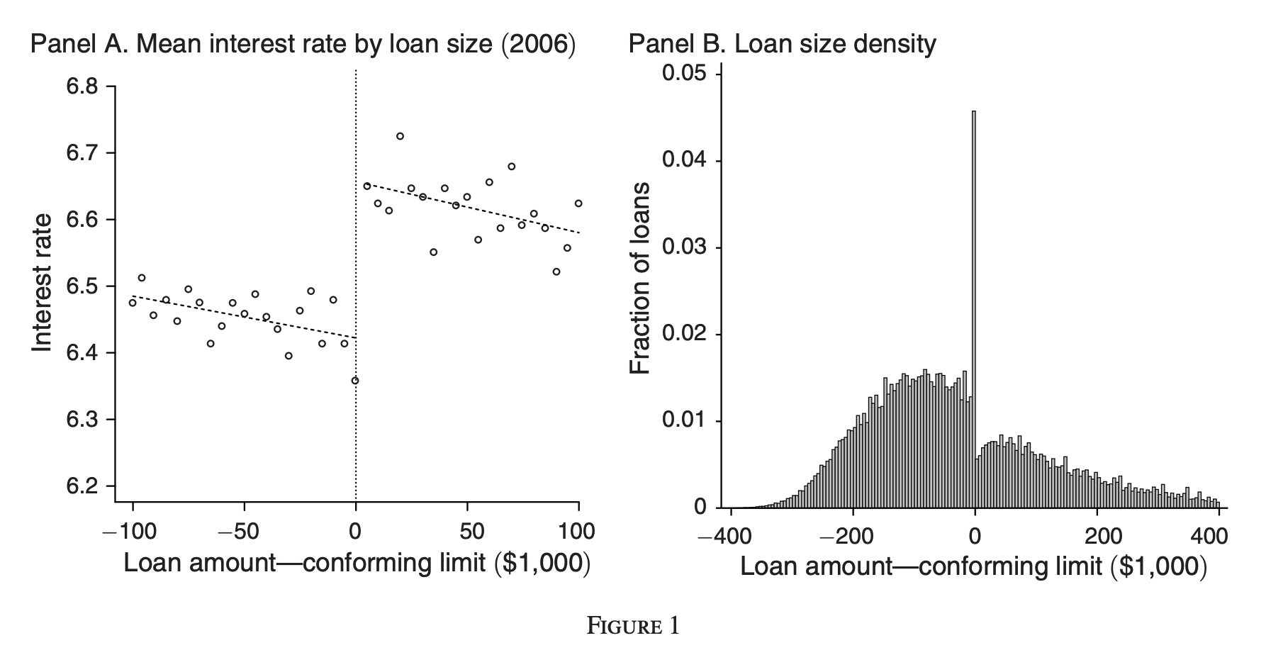
Panel A shows the mean interest rate by loan size for fixed-rate mortgages originated in 2006. It clearly illustrates the discontinuity in interest rates at the conforming loan limit, with a jump of about 20 basis points for loans just above the limit. Panel B displays the density of loan sizes relative to the conforming limit. It shows a sharp spike in the fraction of loans just below the limit and a notable drop immediately above it.
Example 2. Carpenter and Dobkin (2009)
”The Effect of Alcohol Consumption on Mortality: Regression Discontinuity Evidence from the Minimum Drinking Age”
Carpenter and Dobkin use a regression discontinuity design based on the minimum legal drinking age to estimate the causal effect of alcohol consumption on mortality, finding that the easier alcohol availability at age 21 leads to a significant increase in mortality rates.
Their figure 1 shows the age profile of drinking participation for three measures: having 12 or more drinks in one year, having 12 or more drinks in life, and engaging in some heavy drinking in the last year.
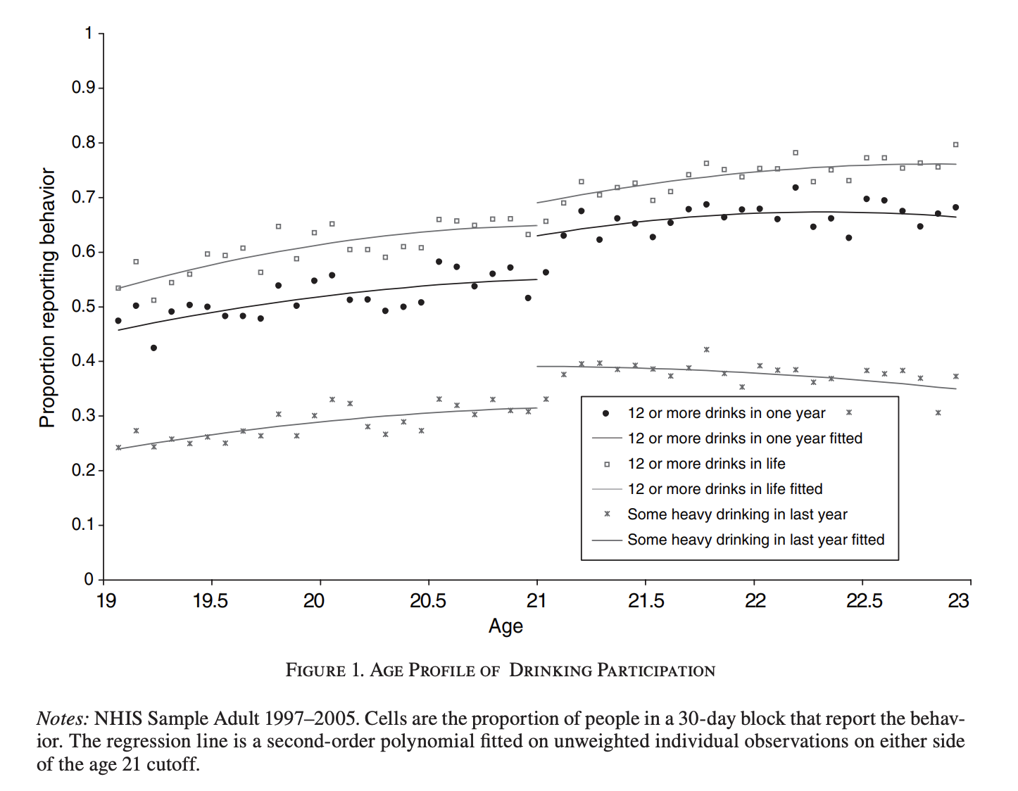
It effectively illustrates the core of the RDD approach. It shows the running variable (age) on the x-axis, centered around the cutoff point of 21 years, and reveals a clear discontinuity in drinking behavior at age 21, visually demonstrating the paper’s key finding.
Example 3. Biasi and Moser (2021)
”Effects of Copyrights on Science: Evidence from the WWII Book Republication Program”
Biasi and Moser (2021) examines the effects of copyright policy on the creation of new scientific knowledge. The authors exploit an exogenous change in copyright policy during World War II, when the US government allowed American publishers to reprint exact copies of German-owned science books under the Book Republication Program (BRP).
Figure 1 illustrates the key finding of the paper by showing citations to BRP books from new work in English versus other languages over time.
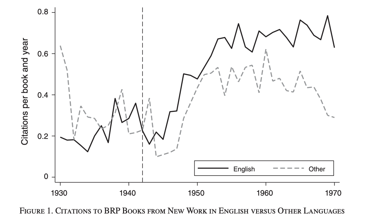
It shows that before 1942, citation rates were similar for both English and other language publications. However, after 1942, there is a marked increase in citations from English-language publications, while citations from other languages increased only slightly. This divergence suggests that the BRP, which primarily affected English-language scholars, led to a significant increase in the use of these books in new research, particularly among English-speaking scientists.
Conclusion
The quest for the perfect Figure 1 is essentially part of a long-winded journey to efficiently conveying complex ideas in a visually compelling manner. As I discovered while preparing this blog, not all Figure 1s are created equal, and I realized that many papers’ Figure 1s strayed too far from a paper’s central thesis. It thus seems very important to make every figure count, especially in an era of diminishing attention spans.
Whether you’re in team “Correlation First, Explanation Later” or “Methodology in a Picture,” the key is to create a visual hook that both captivates and informs. After all, sometimes a figure really is worth a thousand citations.